


We often deal with datasets with 1,000s or even millions of features when building machine learning models. Although this allows us to capture more information in the data, these features are often redundant. Due to the Curse of dimensionality, it's important to limit our data only to capture the key signal in the data and drop the noise.
Dimensionality reduction is a technique we use to reduce the dimensionality of the features space so that we end up with a lower feature space that maintains most of the information in the data.
There are various methods used in dimensionality reduction. The Principal Component Analysis (PCA) is the method that the Kernel PCA generalizes on nonlinear data. Being a dimensionality reduction technique. PCA takes high dimensional data and finds new coordinates, principal components, that are orthogonal to each other and explains most of the variance in the data. The problem with this method is that it's linear.
Therefore, the PCA can only guarantee dimensionality reduction quality only if the data is linear. For nonlinear data, it fails to capture the key features of the data. In this article, we will learn how we can reduce the dimensionality of nonlinear data using the kernel PCA.
Introduction to Kernel PCA
There are many reasons why we may need to reduce the dimensionality of a dataset. Some of the importance of dimensionality reduction include.
- Less computational power and training time.
- Ability to visualize the dataset in lower-dimensional space, which was impossible in higher-dimensional space.
- To escape the curse of dimensionality.
As we previously saw, the ordinary PCA fails to capture critical nonlinearity components when reducing the data dimensionality. This shortcoming is what the kernel PCA comes in to address.
The kernel PCA is an extension of principal component analysis (PCA) to nonlinear data where it makes use of kernel methods. One way to reduce a nonlinear data dimension would be to map the data to high dimensional space p, where $p >> n$, and apply the ordinary PCA there.
Then, mapping the extracted principal components back to the original dimensional space would be as if we learned them while in the original data space. However, it turns out that this approach is sometimes computationally impractical. Sometimes, mapping the dataset to a higher dimensional space than its original space so that we can apply the PCA can be computationally costly.
One of the goals for dimensionality reduction is to reduce computational power need. Thus it's not economical to map the data in higher dimensional space as this can lead it to exist in infinite-dimensional space, which is impossible to deal with. Now, how can we escape this challenge and still enjoy the benefits of higher mapping? The kernel PCA is the answer to this.
We're only interested in the relationship, linear combinations, of the features in the high space, through the kernel. We can obtain these while in the original data space without the need to visit the mapping space. Using the original feature's space, the kernel techniques use the inner product to achieve their goal. Thus, less processing power.
There are various types of kernel functions that we can use to achieve our goal. To learn more about kernel methods in machine learning, I recommend you read this blog.
Now in this article, we will see how we reduce the dimension of a multivariate dataset using the kernel PCA in the Scikit learn library. Let's get started.
Python Implementation
Step 1: Data cleaning
In this phase, we will do some basic data cleaning. We need to import the required libraries and the dataset that we will work on in this section. The link to download the data was provided in the prerequisite section. Make sure you downloaded it.
# import necessary libraries
import numpy as np
import matplotlib.pyplot as plt
import pandas as pd
# import the dataset.
dataset = pd.read_csv("/content/drive/MyDrive/dataset (1).csv")
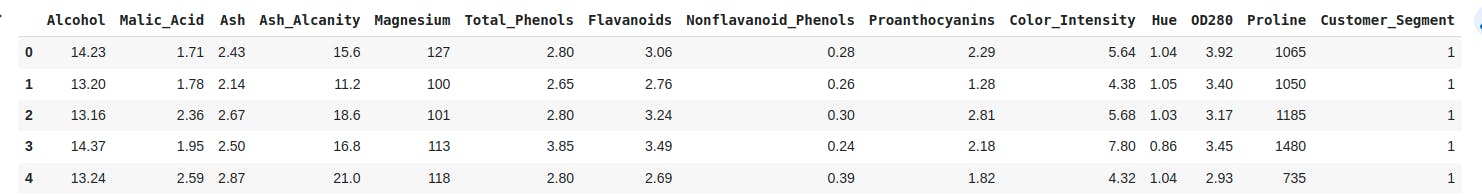
# printing first 5 observations of our dataset
dataset.head()
Output
Next, we separate the features from the study variable and continue to split our data into the training set and the test sets before we scale up our features set.
# seperate features and the study variable
X_feat = dataset.iloc[:, :-1].values
y_targt = dataset.iloc[:, -1].values
# split data into a the training and test set.
from sklearn.model_selection import train_test_split# model for splitting the data
# we split 80% of the data for model training and 20% accuracy model testing
XTrain, XTest, YTrain, YTest = train_test_split(X_feat, y_targt, test_size = 0.2, random_state = 0)
# Scalling the features
from sklearn.preprocessing import StandardScaler
stndS = StandardScaler()
XTrain = stndS.fit_transform(XTrain)
XTest = stndS.transform(XTest)
Step 2: Implementing the Kernel PCA and a Logistic Regression
We will apply the Radial Basis Kernel to lower the dimensions of our data into two principal components. Using these components, we shall fit a logistic regression on them and check its performance using the confusion matrix.
We can accomplish this as follows:
# Import the Kernel PCA class
from sklearn.decomposition import KernelPCA
# initialize the Kernel PCA object
Kernel_pca = KernelPCA(n_components = 2, kernel= "rbf")# extracts 2 features, specify the kernel as rbf
# transform and fit the feature of the training set
XTrain = Kernel_pca.fit_transform(XTrain)
# transform features of the test set
XTest = Kernel_pca.transform(XTest)

# Import the LogisticRegression classifier
from sklearn.linear_model import LogisticRegression
# initialize the classfier
clsfier = LogisticRegression(random_state = 0)
# fit the training data on the classfier
clsfier.fit(XTrain, YTrain)
# import the confusion_matrix
# import accuracy_score to check for model accuracy
from sklearn.metrics import confusion_matrix, accuracy_score
Yprd = clsfier.predict(XTest) # prindicting the X test using our classfier build above

# checking the prediction accuracy of our classifier using the confusion matrix
confusn = confusion_matrix(YTest, Yprd)
print(confusn)
# print the model score
accuracy_score(YTest, Yprd)
This code outputs:
[[14  0  0]
 [ 0 16  0]
 [ 0  0  6]]
1.0
Reducing the dimensionality of our dataset from thirteen features to two key components resulted in a very well-performing model. In addition, our model didn't misclassify any data on prediction.
Now, we need to visualize how data points were classified for both the training and the test set. Let's do that.
Step 4: Visualizing the training set
We will implement a listed colormap with a scatter plot of the training set to visualise this.
You can see that below:
from matplotlib.colors import ListedColormap
XSet, YSet = XTrain, YTrain
# Creating a rectangular grid using XSet values
X_1, X_2 = np.meshgrid(np.arange(start = XSet[:, 0].min() - 1, stop = XSet[:, 0].max() + 1, step = 0.01),
                     np.arange(start = XSet[:, 1].min() - 1, stop = XSet[:, 1].max() + 1, step = 0.01))
plt.contourf(X_1, X_2, clsfier.predict(np.array([X_1.ravel(), X_2.ravel()]).T).reshape(X_1.shape),
             alpha = 0.75, cmap = ListedColormap(('yellow', 'black', 'white')))
# Set the limits of x-axis
plt.xlim(X_1.min(), X_1.max())
# Set the limits of y-axis
plt.ylim(X_2.min(), X_2.max())
for i, j in enumerate(np.unique(YSet)):
  # create a scatter plot using XSet and YSet
    plt.scatter(XSet[YSet == j, 0], XSet[YSet == j, 1],
                c = ListedColormap(('red', 'green', 'blue'))(i), label = j) # creat a colarmap of a discrete colour levels
# add tittle to the plot
plt.title('Logistic Regression for Training set')
# labelling the x-axis
plt.xlabel('PC1')
# labelling the y-axis
plt.ylabel('PC2')
# generate a plot key
plt.legend()
# print the scatter plot
plt.show()
Output:
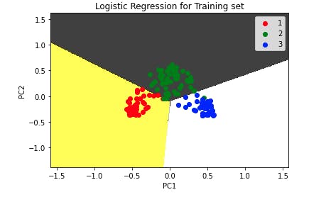
The plot shows no misclassification.
Step 5: Visualizing the test set
We shall use our test set here. The implementation of this visualization is as follows:
from matplotlib.colors import ListedColormap
XSet, YSet = XTest, YTest
# Creating a rectangular grid using XSet values
X_1, X_2 = np.meshgrid(np.arange(start = XSet[:, 0].min() - 1, stop = XSet[:, 0].max() + 1, step = 0.01),
                     np.arange(start = XSet[:, 1].min() - 1, stop = XSet[:, 1].max() + 1, step = 0.01))
plt.contourf(X_1, X_2, clsfier.predict(np.array([X_1.ravel(), X_2.ravel()]).T).reshape(X_1.shape),
             alpha = 0.75, cmap = ListedColormap(('yellow', 'black', 'white'))) # partions colouring
# Set the limits of x-axis
plt.xlim(X_1.min(), X_1.max())
# Set the limits of y-axis
plt.ylim(X_2.min(), X_2.max())
for i, j in enumerate(np.unique(YSet)):
  # a scatter plot XSet and YSet, both are sets of the test set
    plt.scatter(XSet[YSet == j, 0], XSet[YSet == j, 1],
                c = ListedColormap(('red', 'green', 'blue'))(i), label = j) # creat a colarmap
# add tittle to the plot
plt.title('Logistic Regression for Test set')
# labelling x-axis
plt.xlabel('PC1')
# labelling y-axis
plt.ylabel('PC2')
# generate a plot key
plt.legend()
# print the plot
plt.show()
Output:
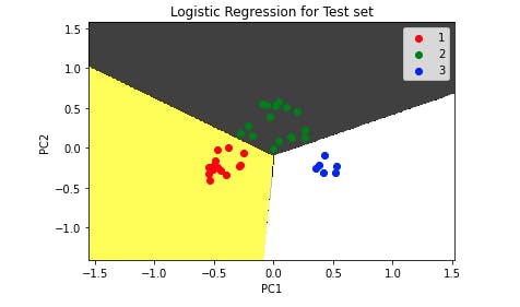
As we can see from the test set, the model correctly classifies all the data points.
Conclusion
In this article, we introduced the concept of dimensionality reduction and its importance. We briefly discussed the PCA method and its limitations of how it is unable to capture nonlinearity in nonlinear data.
This was the key problem that the Kernel PCA came to address. As we discussed, the kernel PCA uses kernel methods to reduce the dimensionality of nonlinear data with less processing power. Finally, we showed how we implement the Kernel PCA in Python using the scikit learn library.